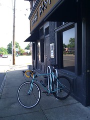
 One of the nuances of bicycle racks that I've picked up on (as I'm sure you have as well) is orientation with their surroundings. What we saw with the Art Center bicycle rack, as well as several others, is that you can inadvertently limit the number of bicycle spaces available depending upon how the rack is positioned. With the Bari bicycle rack, not only are they cutting the available spaces in half but are also (when bicycles are appropriately placed) limiting the amount of sidewalk traffic that can pass safely. Notice that with my rear wheel touching the building and even with my front wheel askew there is not enough room for two people, or even one wheelchair to pass.
What should they have done? Placed the rack on an east-west line. The available spaces are not diminished, the bicycles do not stick out further than the middle crack (more or less), and the rack is then visible to Cooper Street's vehicular traffic.
Regardless, I'm glad to see that a local restaurant is inviting cyclists to their tables. The food at Bari is great and I hear the owner rides a bit as well.
Here's how it racks up:
Form - Wave
Function - Fail
Environment - Doesn't blend
Points of Interest - Bari Ristorante
1 comment:
very observant ab pedestrian usage shared with bikes.
Post a Comment